Client
PureIs CBD
Design
Natalia Zajdel
Art Direction
Néha Prashar,
Natalia Zajdel
Creative Direction
Cat Howard
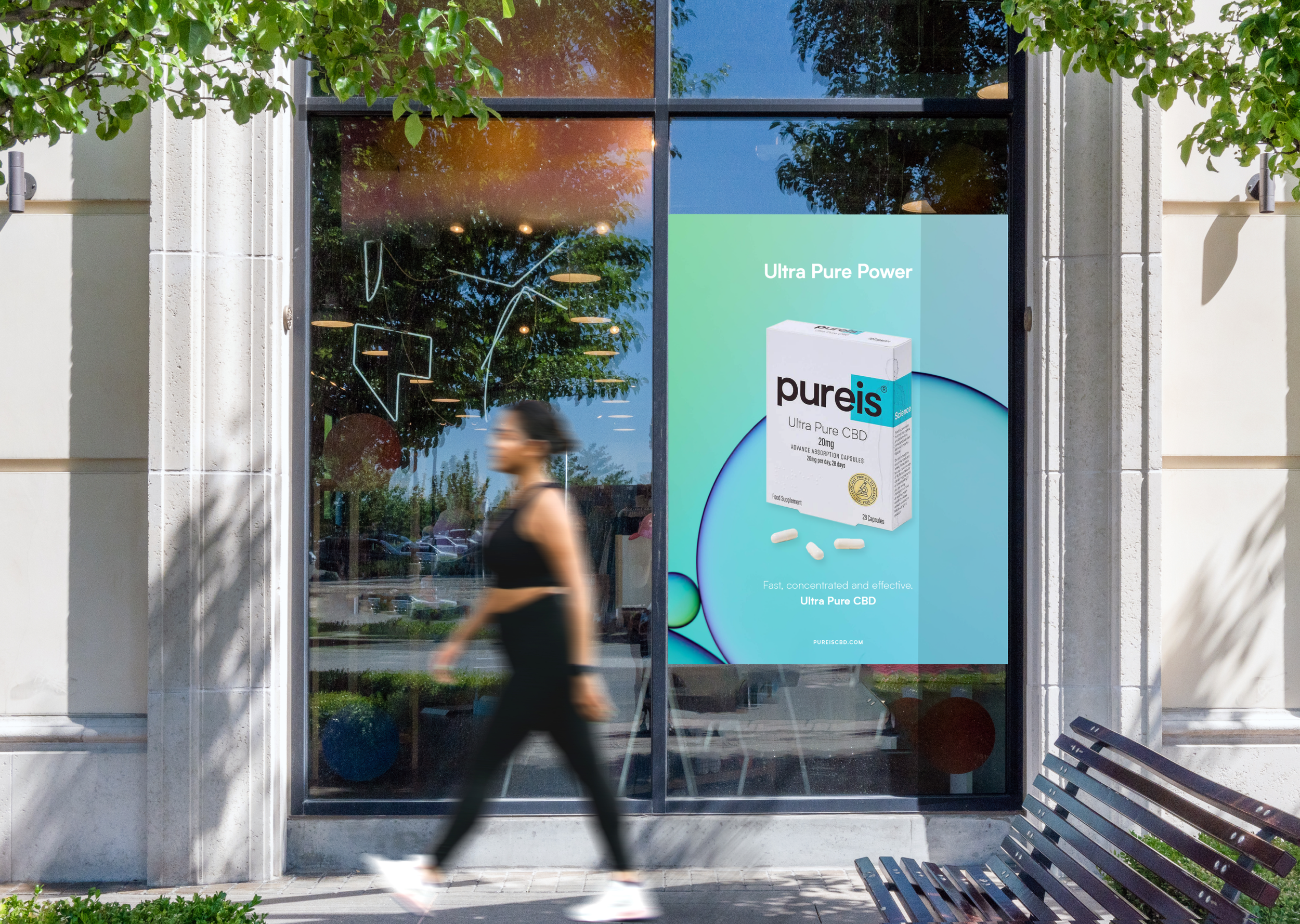
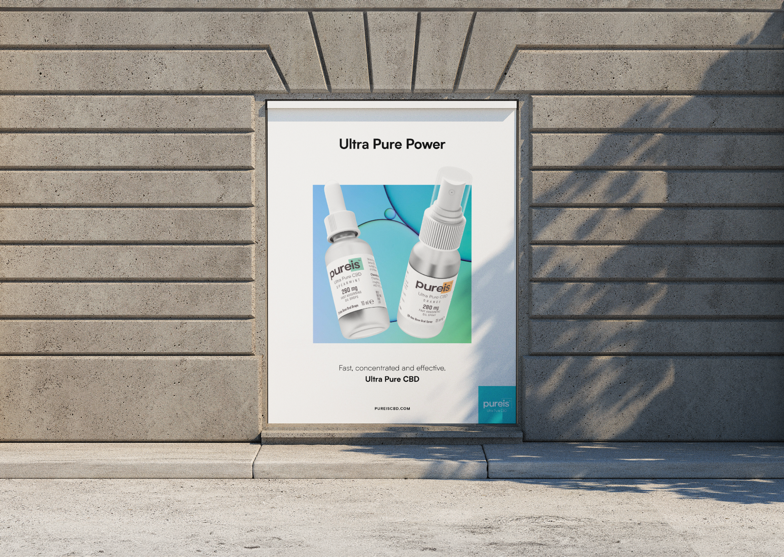
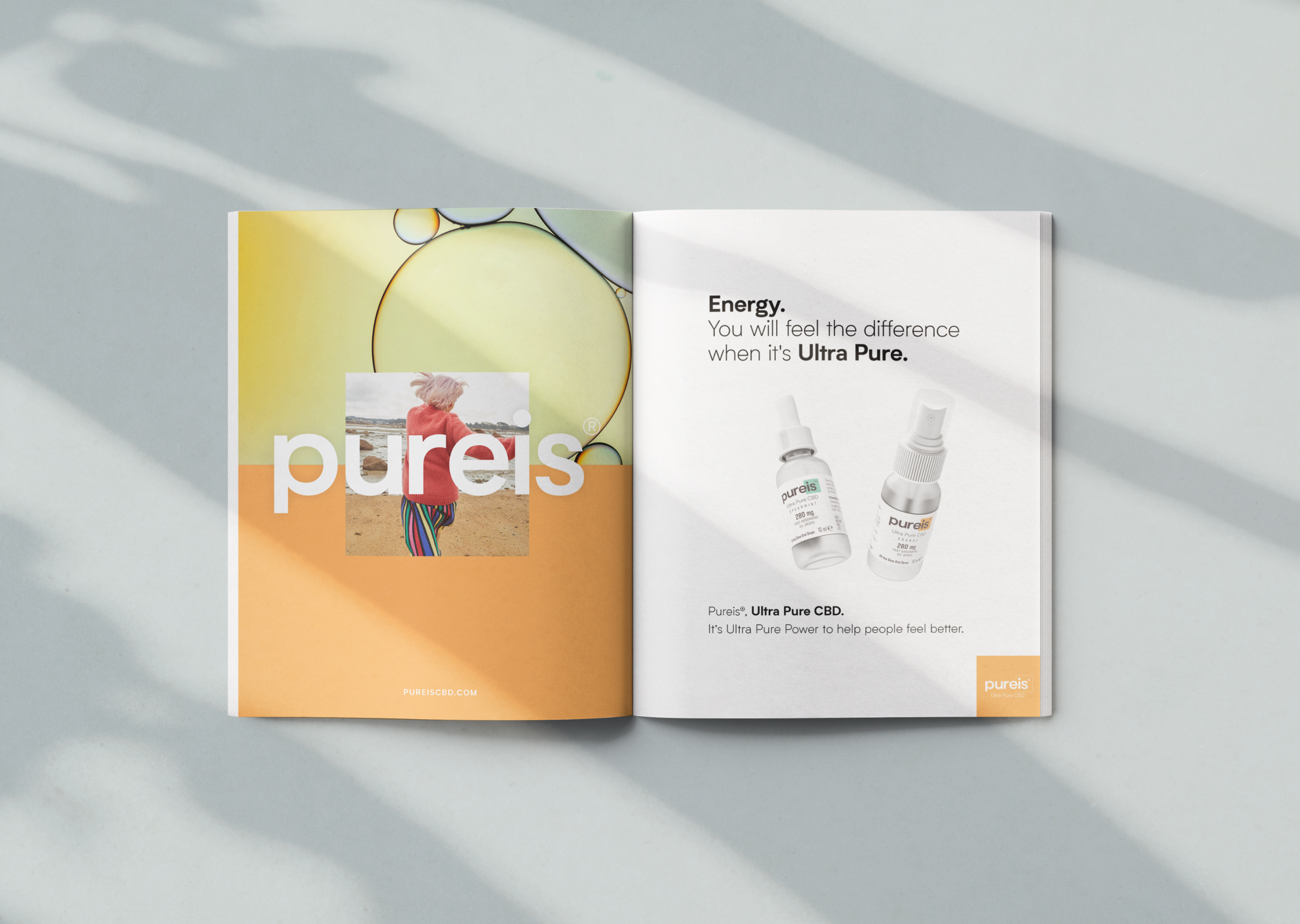
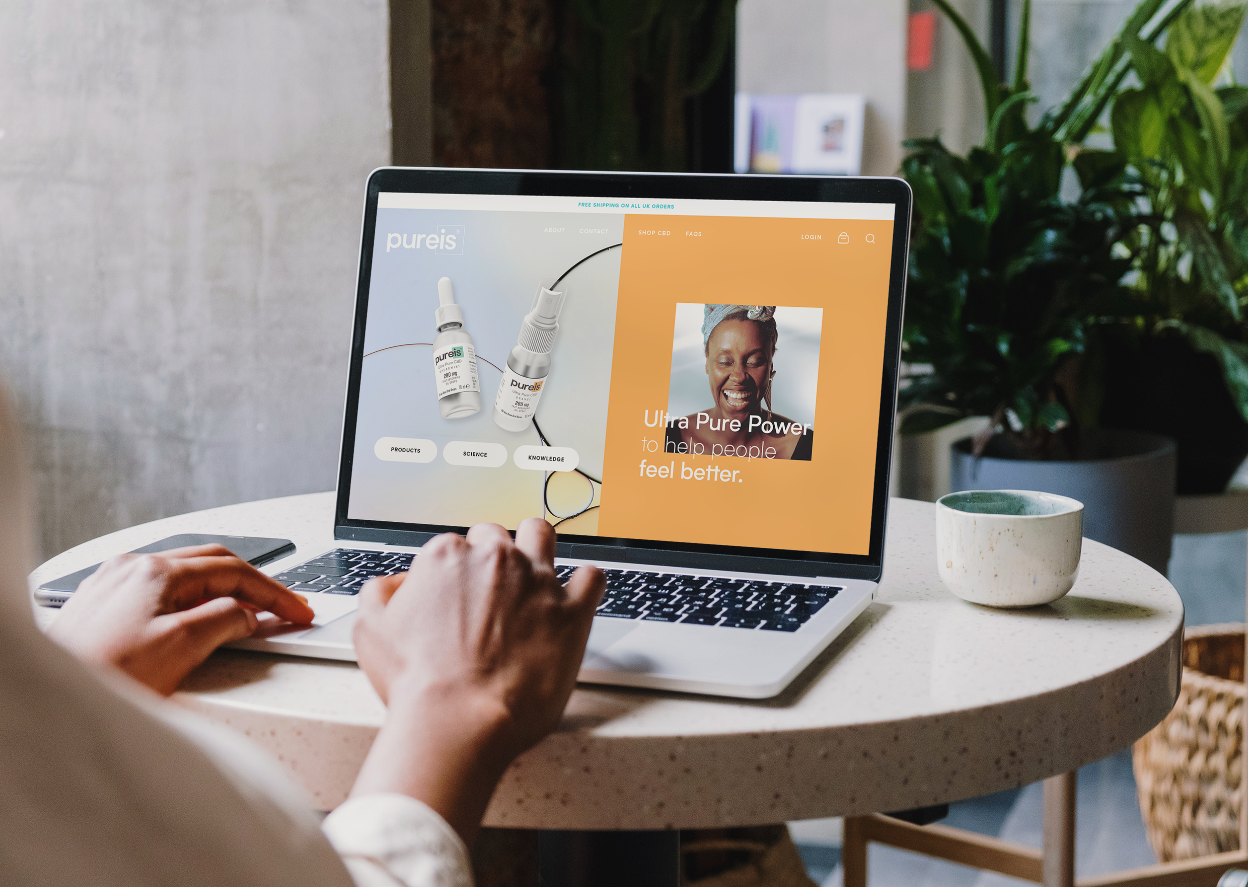
The Brief
Position Pureis CBD as the leading CBD brand in the UK market through a combination of refreshed visual language and strategic social and brand initiatives, while maintaining the core brand guidelines and logo.
Approach
I collaborated closely with the Creative and Design Director on all aspects of the project; From inception to delivery. I took the lead on delivering the brand book after the Design Director departed, which allowed me to take on greater responsibilities and make central creative decisions.
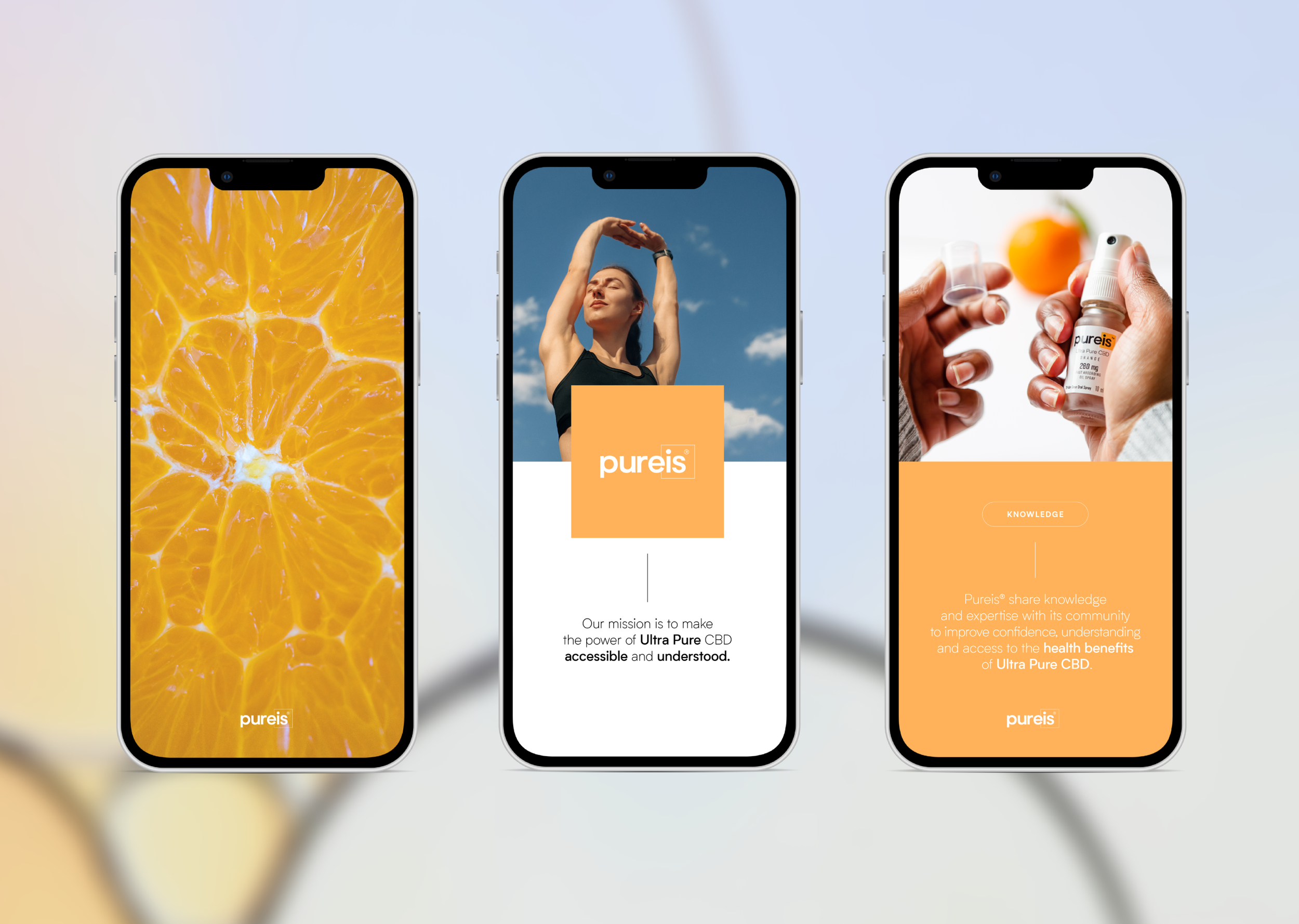
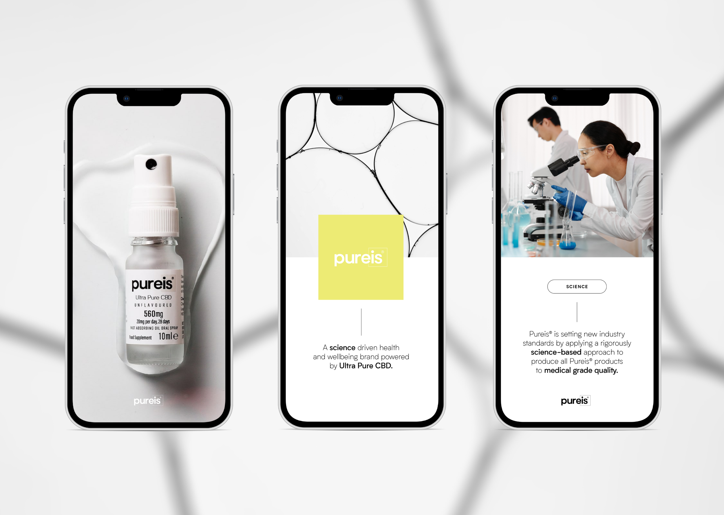
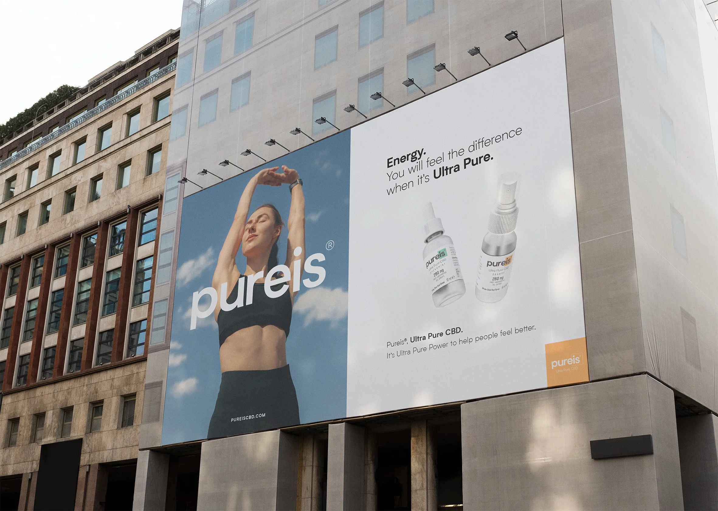
Our goal was to strike a balance between the scientific and human qualities of the brand. The client wanted to emphasise both the benefits of CBD on the human body and their commitment to a 100% lab-made product. We explored various visual approaches to achieve this, from using illustrations and diagrams to convey the benefits of CBD to incorporating shapes that symbolised balance, a core theme in the branding and design.
Ultimately, we chose the square as the primary visual element. It’s simplicity offered versatility; it served as both a frame and a building block, allowing us to integrate it in exciting new ways throughout the designs.