Client
Aspria
Creative Direction
Greg Lappage
Art Direction & Design
Natalia Zajdel
Awards
The Drum Awards, Design/Brand 2026 (Nominated)
Concept
Natalia Zajdel,
Connell Greene
The Brief
We partnered with Aspria, a leading European health club, to refine and expand their brand identity across multiple platforms for their January 2025 campaign. By redefining their brand guidelines, we established a more sophisticated and cohesive visual language that reinforced their premium positioning, and connected with their members on deeper, more personal level. The client later came back with a request to refresh the campaign with new imagery for Autumn period.
Exploration
Working closely with the strategy team, we dug deeper to uncover not just what draws people into wellness, but into the emotional truths behind why they stay. From this, we shaped a visual narrative rooted in empathy, energy, and meaning.
The spark came from a striking insight: over 80% of New Year’s resolutions fail, mostly because they’re too unrealistic. We knew we didn’t want to add to the noise with another quick-fix fitness message.
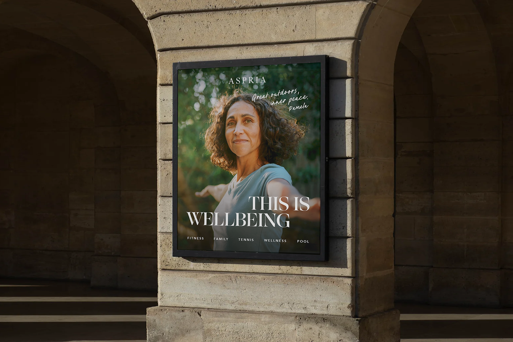
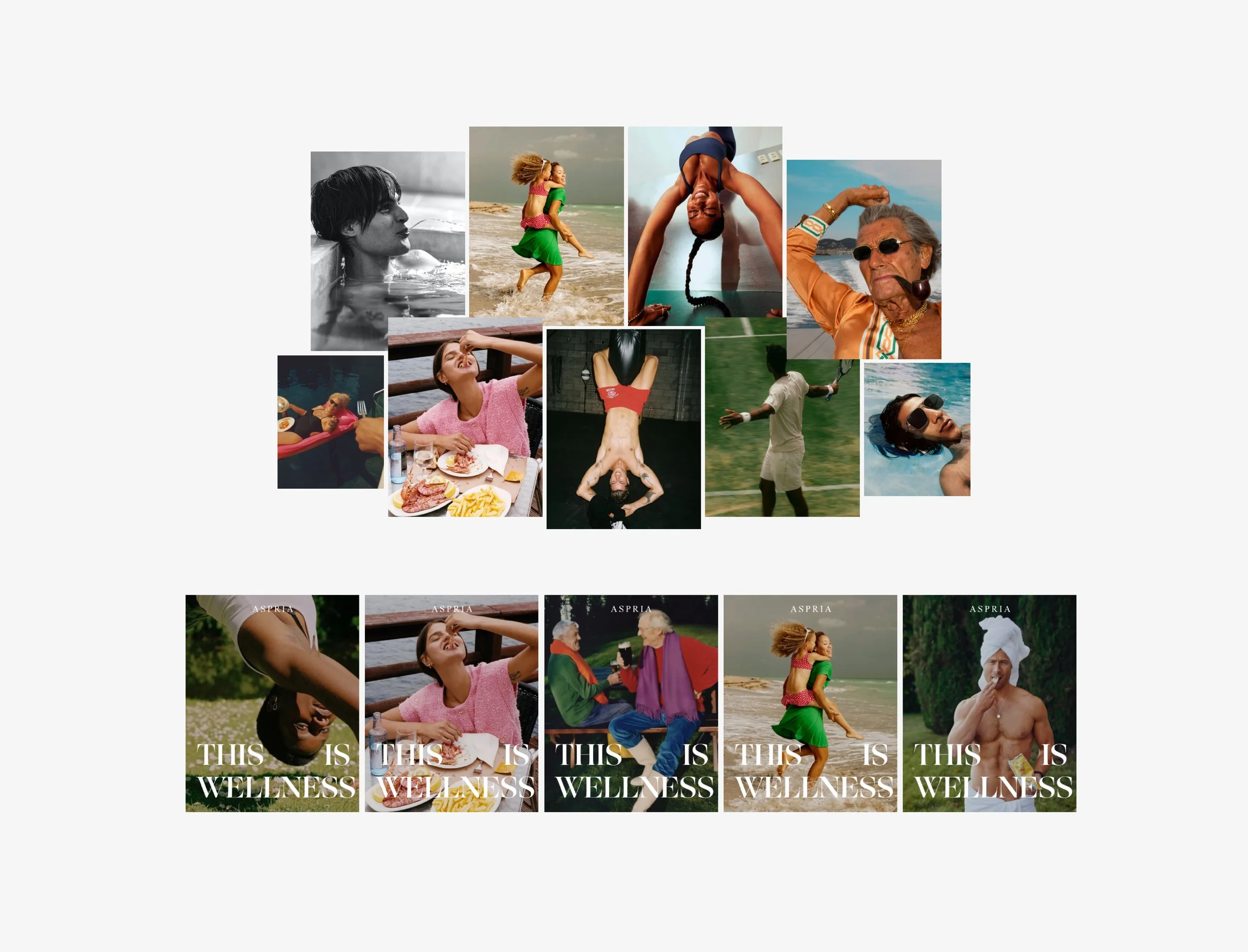
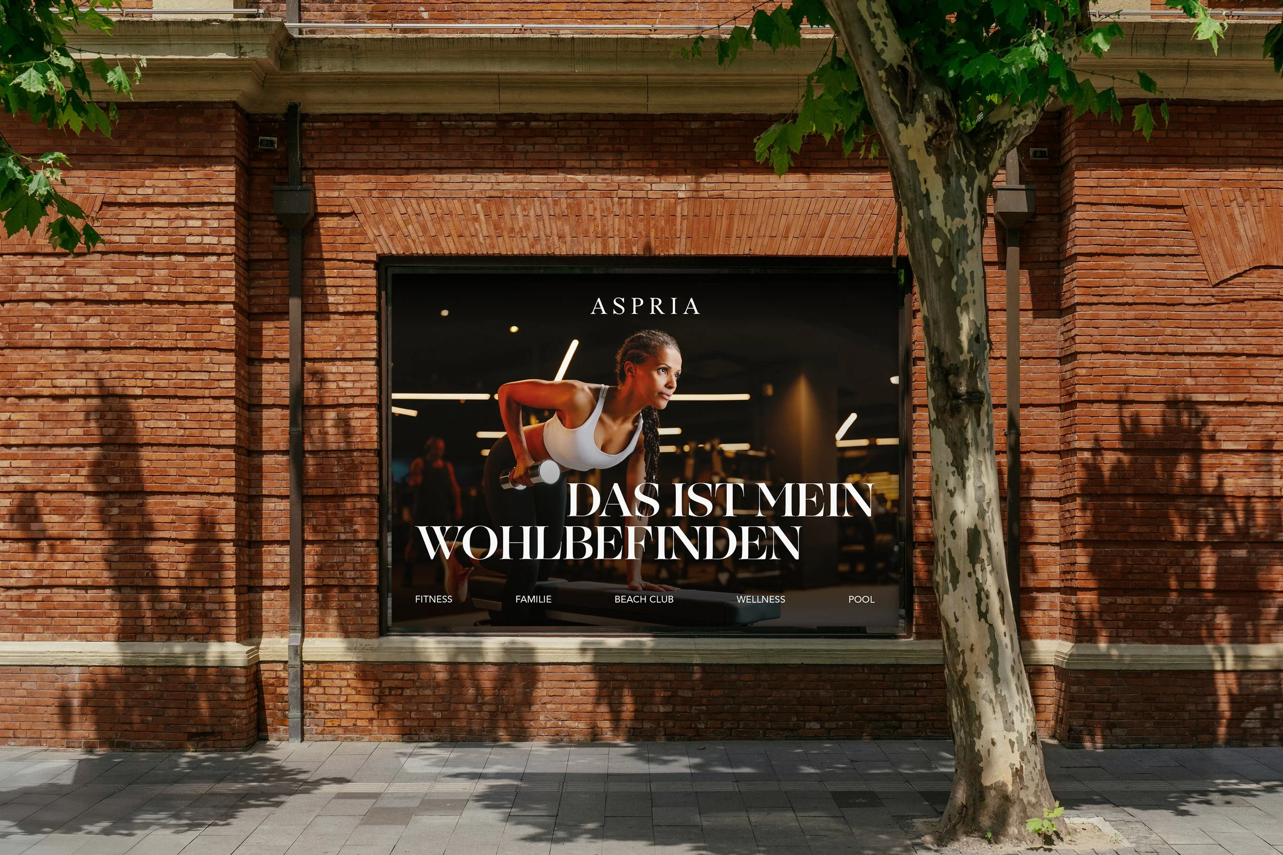
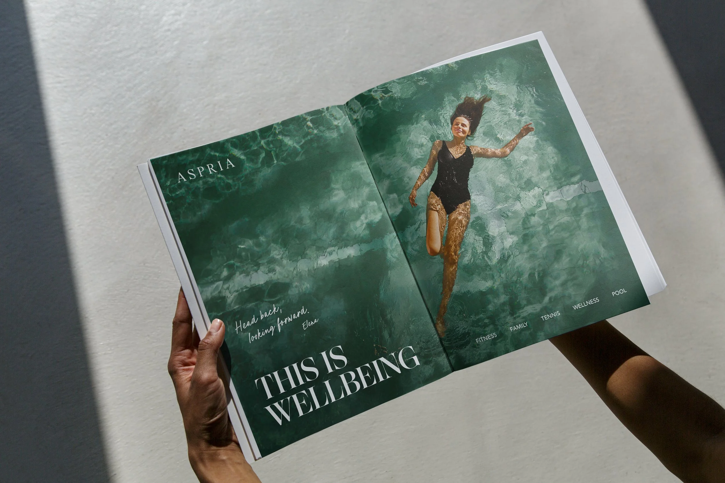
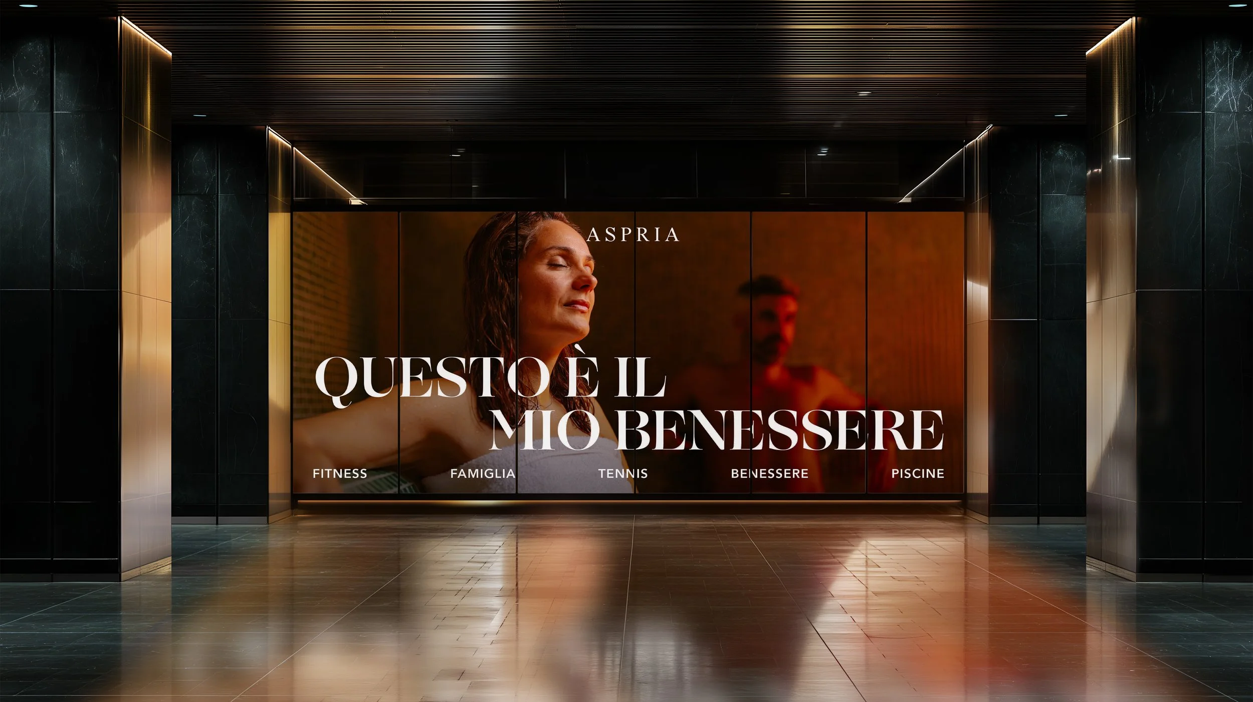
Instead, we created This is Wellness, a campaign that redefines what wellness looks and feels like today. Through a playful and transgressive lens, we celebrated the imperfect, individual, wonderfully human paths we take to feel good. A creative invitation to embrace your own version of wellbeing, and to leave perfection at the door.
Direction
During the development of the campaign, the client opted to use a mix of their own assets and stock imagery instead of an art directed photoshoot. As a result, our creative approach needed to flex and evolve in response to their needs without compromising the integrity of the concept.
We remained committed to celebrating the balance of the spectrum of wellness, maintaining a contemporary, elevated visual style throughout. Our focus shifted to exploring smart, intuitive layouts, allowing imagery and typography to work in harmony, and letting the design be led by what felt authentic, balanced, and beautiful.
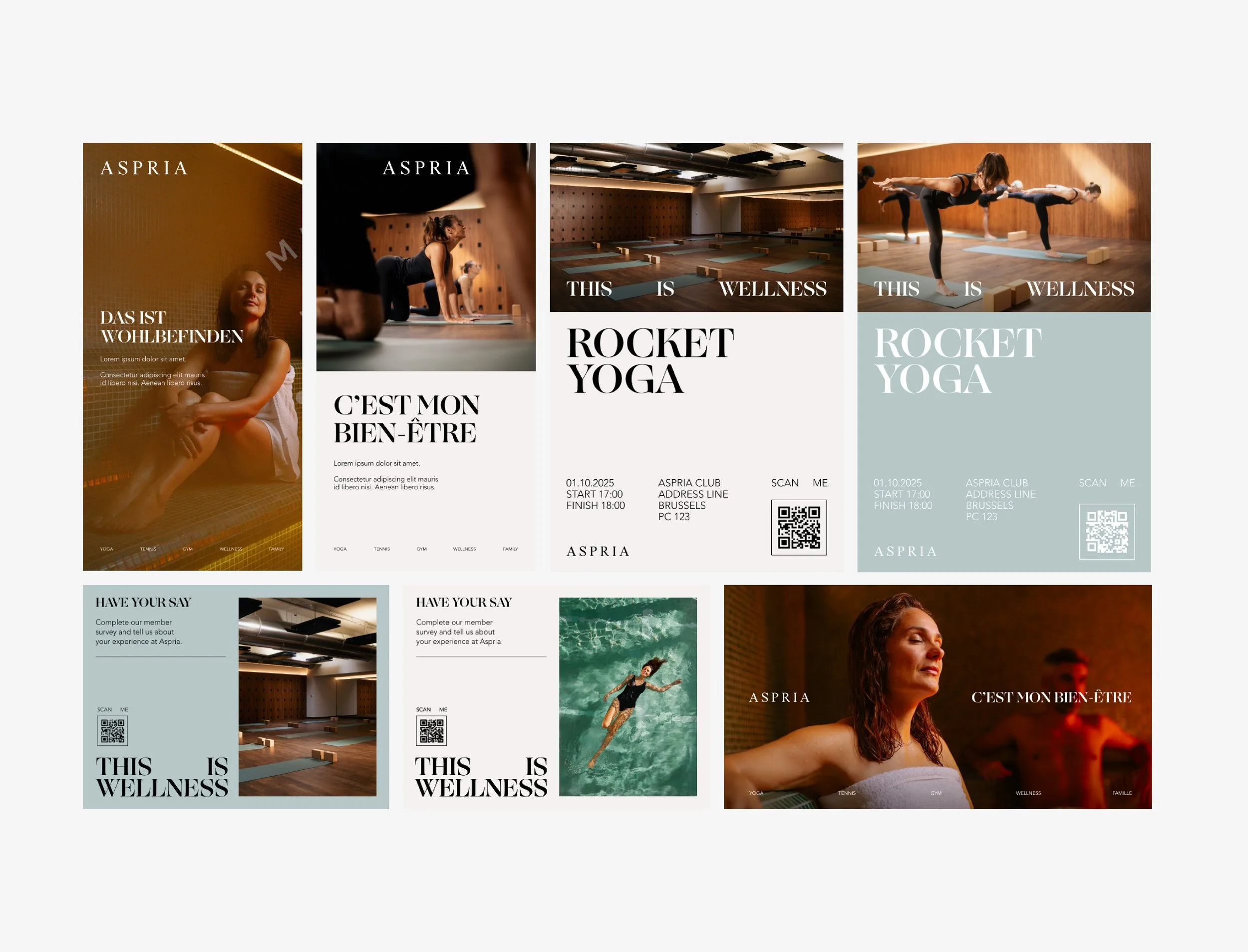
As the campaign evolved, we strategically refined the naming from Wellness to Wellbeing, a deliberate shift to ensure clarity, nuance, and translatability across Aspria’s multilingual audience. This linguistic precision informed the creation of This is Wellbeing as the core campaign line, offering a clear, ownable platform that could flex across channels while staying rooted in the brand’s promise.
Visual Refresh
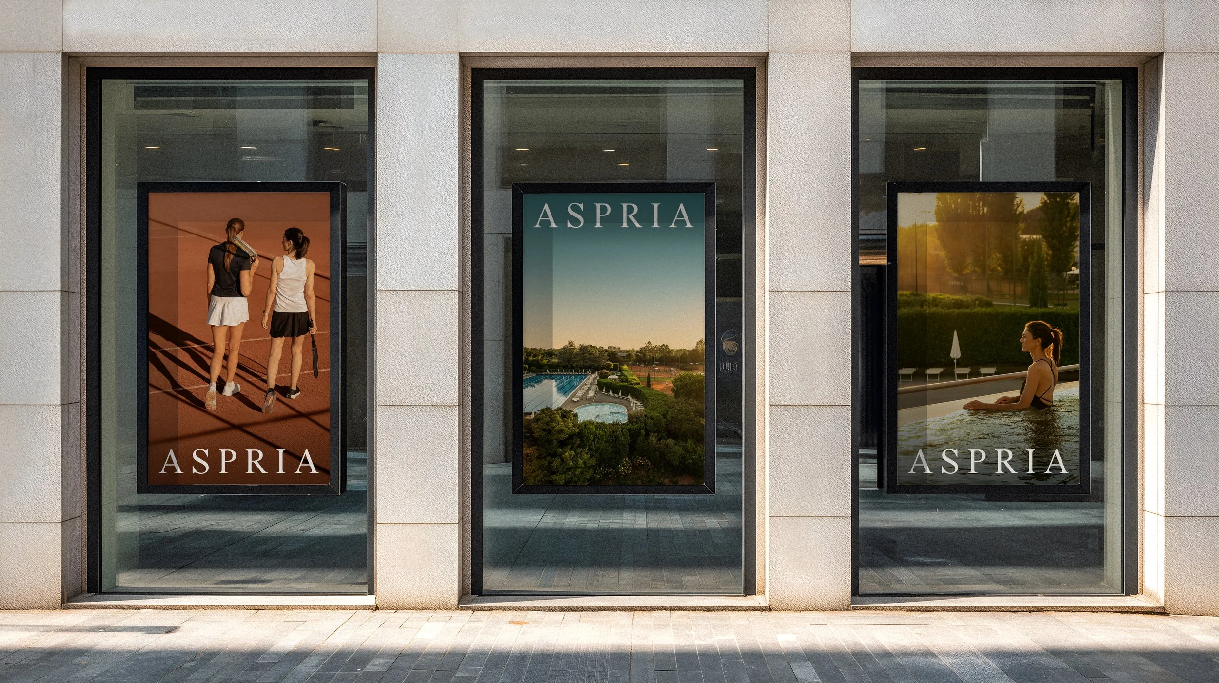
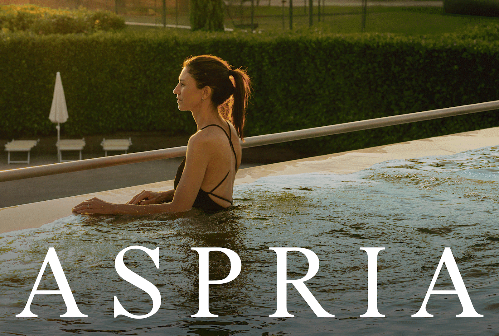
With the success of the January campaign, the client came back to us with a request to refresh the visual identity for the Autumn period.
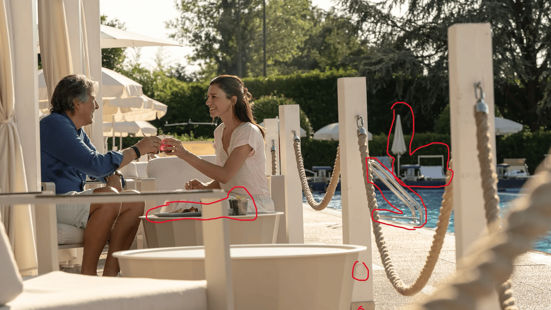
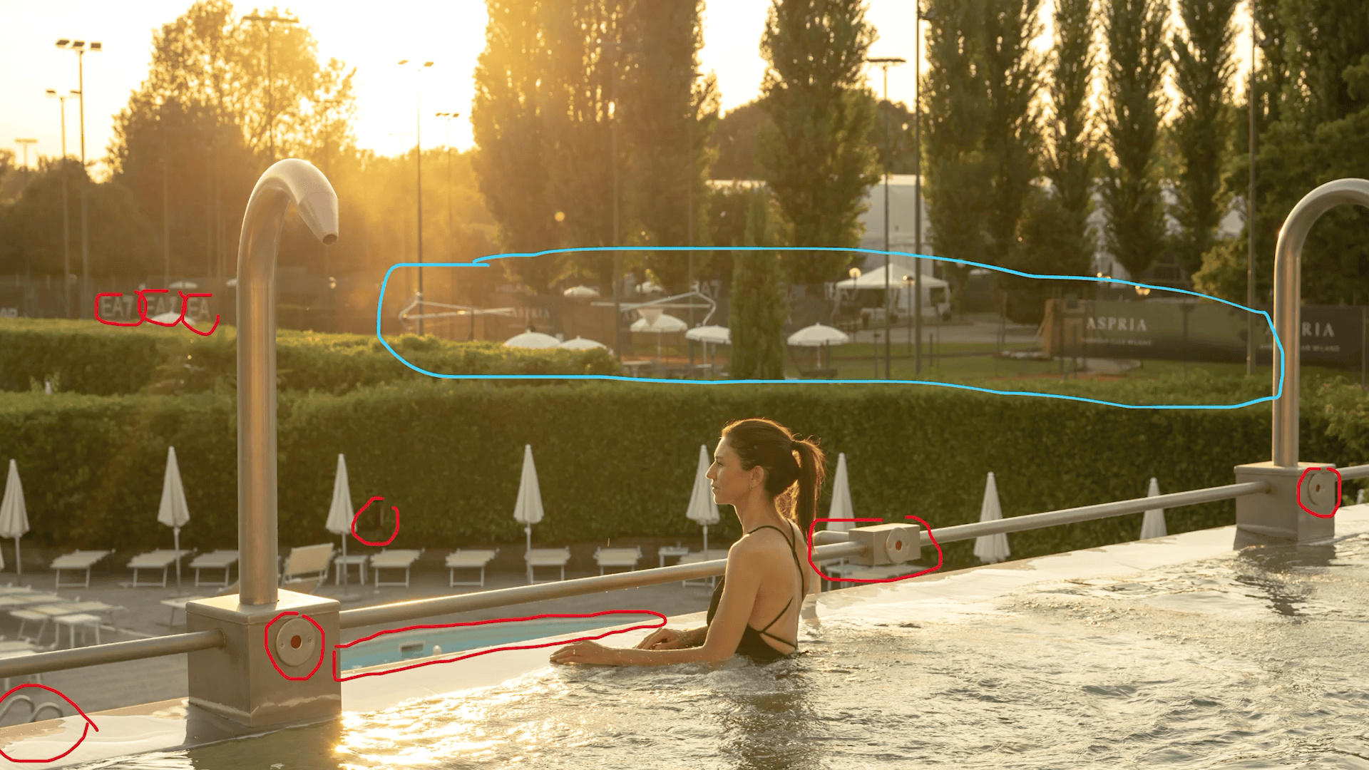
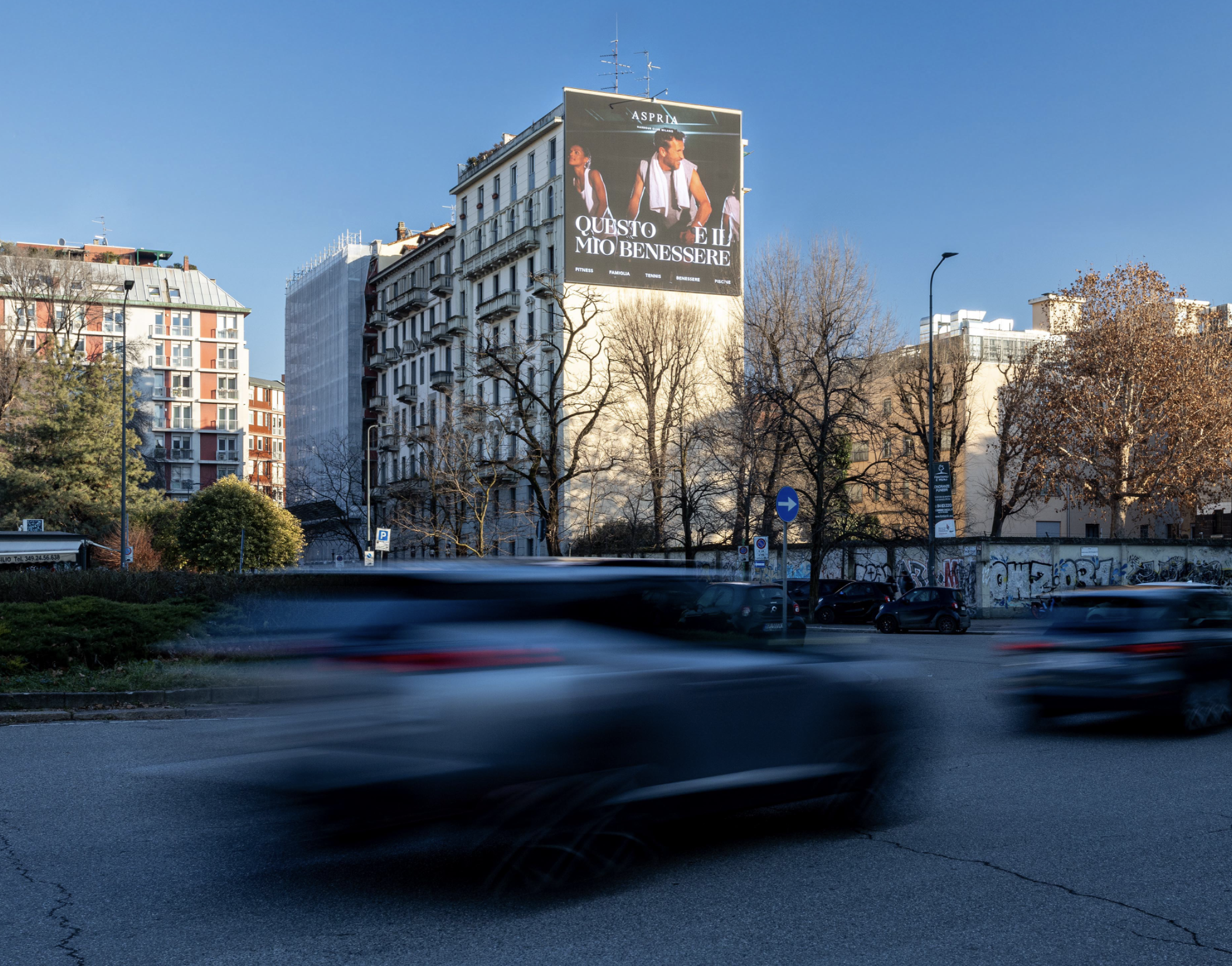
For this season, we wanted to continue to focus putting the balance of the spectrum of wellness and personal wellbeing at the centre of the story. By adding warmth and capturing the essence of Aspria from a wider lense, showcasing it’s overall ecosystem and capturing a balance of facilities and members. Positioning the Wellbeing as a place of connection at Aspria.
Working with the creative team we refined the overall conceptual approach, and I had the pleasure to Art Direct the concept from inception to briefing the photographer and retoucher, shaping the visual language.
Art Direction
Visually, the refreshed concept takes a step back and zooms out of the individual point of view of the members. Instead, we focus on the bigger picture and the interconnected ecosystem which supports Aspria’s members full wellbeing journey as well as their curated spaces, expert facilities and inviting atmosphere.
While crafting the photography brief, I had to be mindful of the importance of clear direction, as the team was not able to fly out to Milan where the shoot was being captured. The photographer followed our direction and managed to stay focused on the campaigns objectives whilst following the curated visual language from the brief.
Later we worked with a photo retoucher who helped us refine the captured moments into polished, premium visuals.